" height="39.61165048543689px" id="ZNWWQDUsB" transform="translate(0 0.195)" width="39.79498837473122px"/><path d="M 14.36 13.33 C 15.643 13.33 16.374 11.864 15.601 10.841 L 7.888 0.619 C 7.048 -0.494 5.28 -0.022 5.107 1.362 L 4.627 5.196 C 4.496 6.248 4.009 7.224 3.248 7.963 L 0.475 10.653 C -0.526 11.624 0.161 13.32 1.555 13.321 Z" fill="rgb(255, 87, 199)" height="13.329661963960334px" id="BFIxPoook" transform="translate(3.344 8.474)" width="15.91740701520282px"/></svg>)

“Metrics are hurting.”
“Hurting” isn’t usually a software engineering term, so I was caught off guard during a spontaneous Slack huddle with Mike Buss, colleague and fellow designer at Arcol. But he quickly followed up with a Figma mockup, grinning ear to ear.
“I’m trying to decide between collapsible sections... or maybe a sidebar,” he said.
I wasted no time hopping into the file. The next hour was a blur of design jams, playful chaos, and an evolving concept for a better metrics experience.
Spoiler: we went with the sidebar.
Metrics aren’t just numbers. They’re what make or break deals for architects, especially when they’re working with clients, consultants, or developers. These figures speak the language of cost, scale, and feasibility. If they’re off, the whole pitch can fall flat.
When Mike said metrics were hurting, he meant it was a product pain point. And it’s been a long running one at that, at the back of Mike’s mind for almost a year. While the current feature worked, it had grown to a point where it became clunky and confusing, especially for new users trying to setting up their metrics. And since Arcol was launching to the public in four weeks, it was important that we got this right.
Key Takeaways
UX-Driven Redesign: Arcol overhauled its metrics interface to improve Information Architecture, moving from clunky submenus to a persistent sidebar and interactive tables.
Hybrid Roles: Utilizing a designer/engineer hybrid role allowed for rapid prototyping and implementation without the friction of traditional handoffs.
Quality over Speed: The team chose to delay a complex feature to ensure a polished "fast-follow" release rather than rushing a sub-par experience for launch.
Micro-Interactions Matter: Small refinements—like larger click targets, optimized loading animations, and keyboard navigation—collectively enhance product delight.
Human-Centric Tools: Successful software development balances technical precision with emotional resonance and community feedback.
Information Architecture
A well laid-out building puts rooms where you’d expect them to be. You can find your way around easily, and there’s no confusion about or whether push doors should be pulled or vice versa. The software equivalent is Information Architecture, which was the key focus for our redesign. We didn’t add any or remove any features from the metrics experience, but instead, improved how they are laid out.
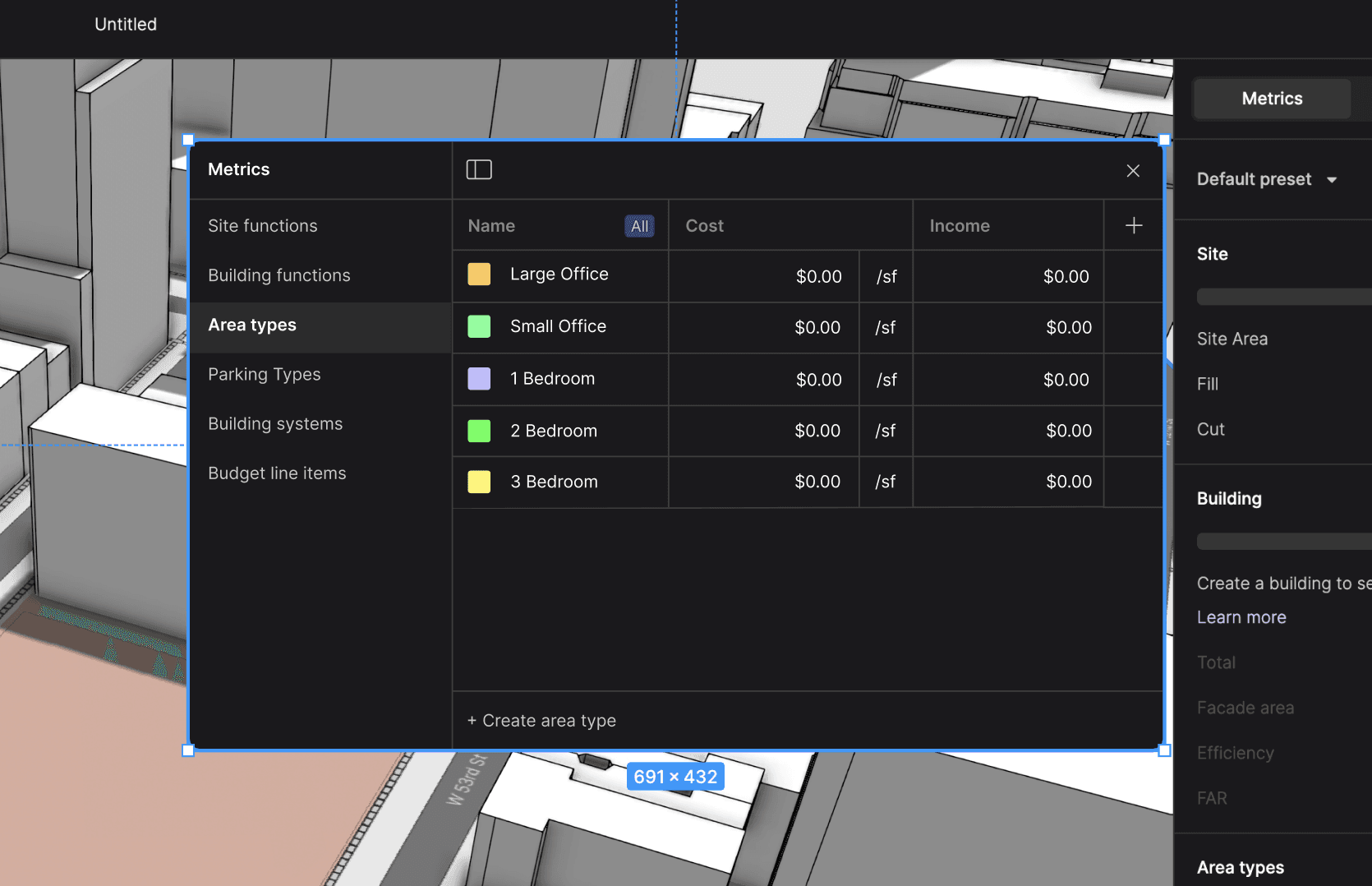
For example: Let’s say you’re trying to edit Area Types in the existing model. Starting at the Metrics sidebar, you’d scroll down to the Area Types section, then hover over it to make a settings icon appear. Right? Wrong - that’s actually the Area Types filter. You actually have to go to the Building section, hover over it, then look under two layers of submenus.
In the new design, there’s only one settings button, which stays at the top when you scroll. Instead of submenus, there’s a sidebar with labels, including one for Area Types. The previous filter menu (not pictured) now has a filter icon, more clearly conveying what it does, and stays visible even when you’re not hovering.
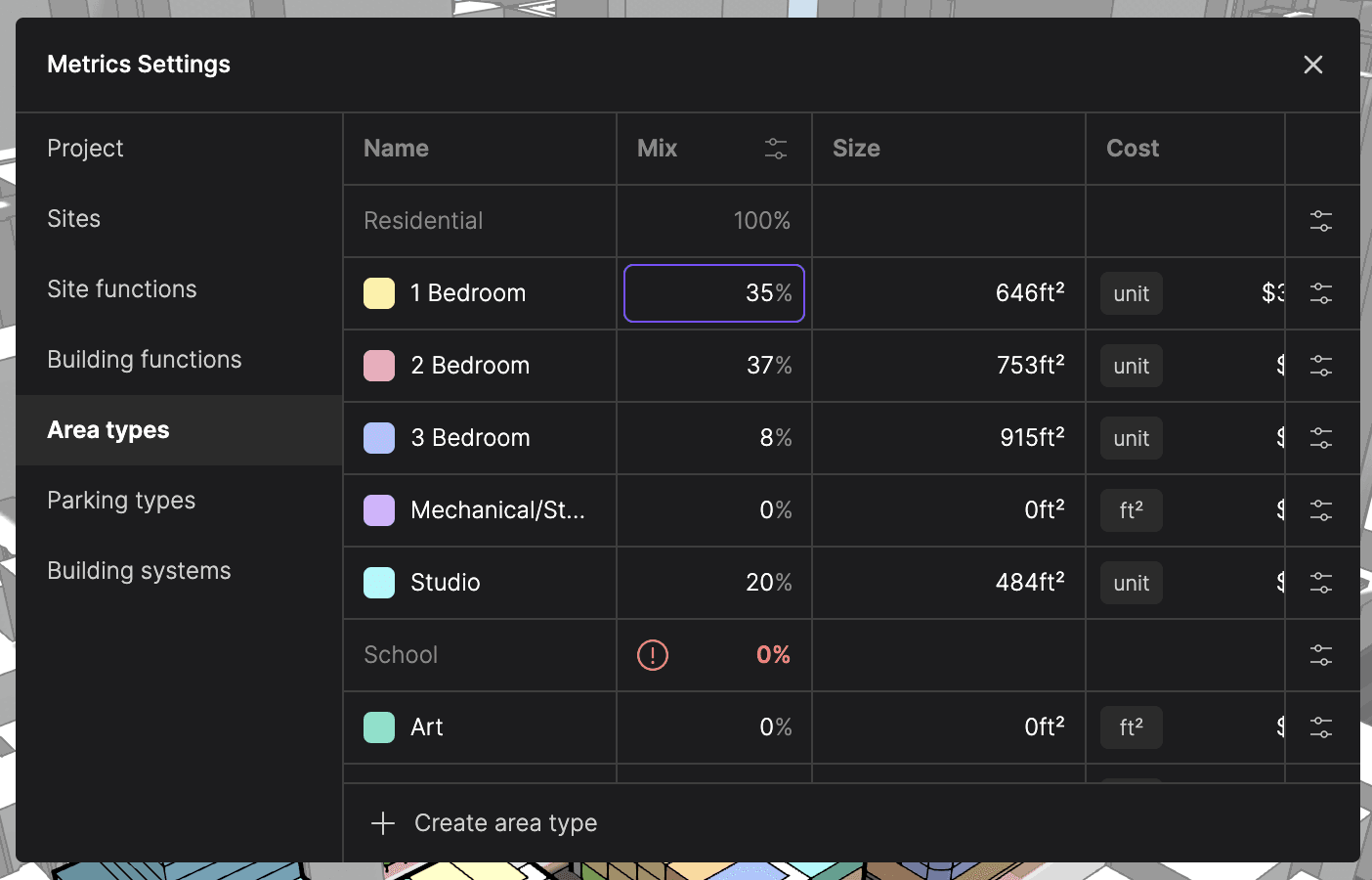
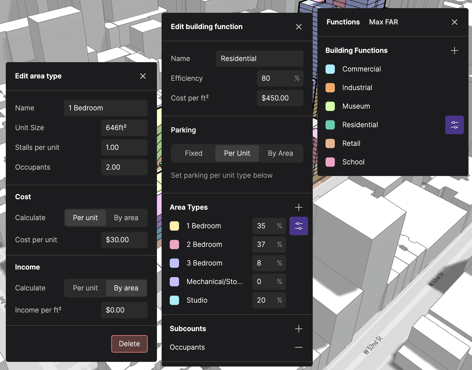
Within each sidebar category, data is now edited in interactive tables, which makes the whole experience so much smoother. Gone are the days of having to click between Area Types to edit them. And while the advent of tables may feel familiar to architects who are used to spreadsheets, we level up the experience with inline totals and mini toggles that let you mix and match units per cell. And did I mention that you can navigate it with your keyboard?
Under Construction
While design jamming is great, one could say the real magic at Arcol is how quickly a “what if?” can turn into a working prototype. Spontaneous huddles and Slack comments will end up in PRs and merged later that day. Everything is open to be tweaked and improved, and in this case, completely rethought and rebuilt from the ground up.
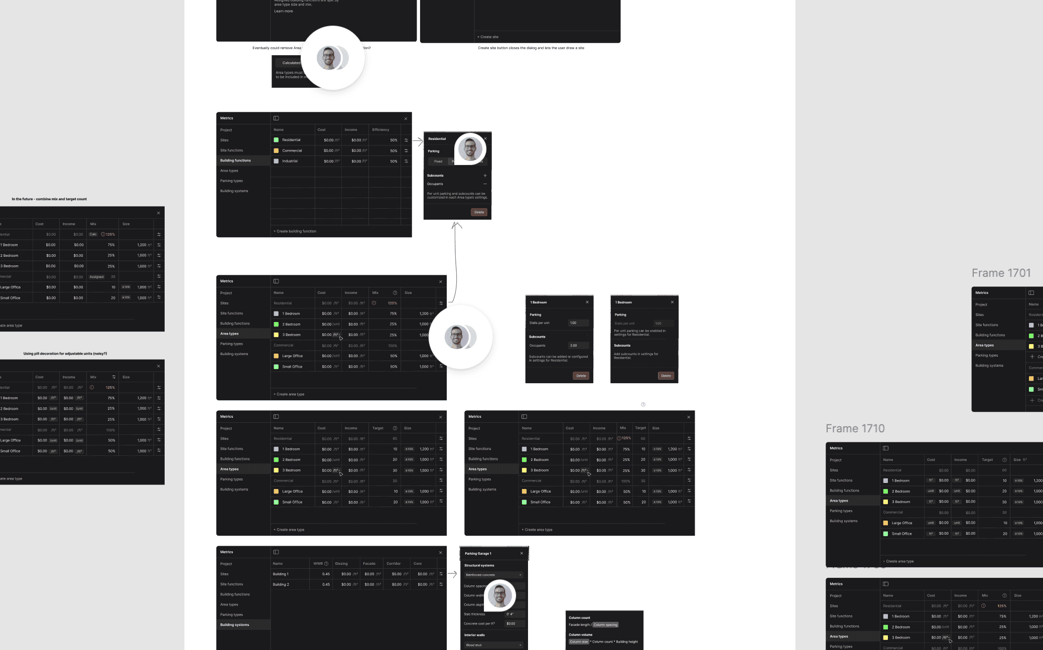
I took the lead on the feature, making a few more design passes over the next few days with Mike’s feedback. And without skipping a beat, I jumped right into implementation. As I was both designer and engineer on the feature, there was no handoff needed. In fact, I had made the designs with implementation in mind, down to the smallest micro-interaction. That’s just one of the unique pros of being in a designer/engineer hybrid role, to pat myself on the back.
At three weeks before launch, things were starting to come together quickly. Vercel preview builds let me share my work with Mike before it hit staging, and from early testing, Mike and I knew we had something special. Even, our go-to-market guy Aaron hopped on the excitement train, pitching prototypes to early customers. It was night and day from what we had before, and we couldn’t wait to get this shipped for real.
Down to Brass Tacks
Two weeks before launch, Thomas, our head of engineering, walked us through launch readiness. With everyone in the room, we faced a tough decision.
On one hand, we knew our feature would greatly improve the user experience, especially to the wave of new users that launch would bring in. But on the other hand, one of the tables wasn’t ready yet, and it was the most complicated one. Though it could be rushed out the door in the next two weeks, more time would allow us to collect feedback and deliver a more polished experience.
We decided to launch without the feature, instead making it a fast-follow. It was a joint decision, and although I felt disappointed, I think was the right one. At the end of the day, even though the existing metrics experience was clunky, it was workable.
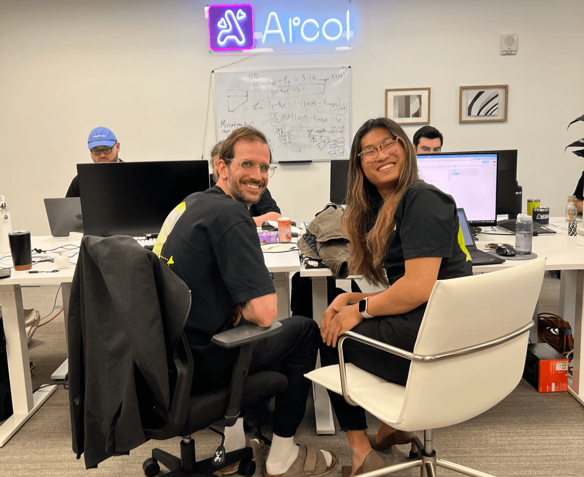
In the last week before launch, the team convened at Arcol’s New York office. It was nice to see my colleagues in person, and getting to know them over lunch. The energy in the room was palpable, second only to the velocity - most Slack conversations that week were duly replaced by a holler and scoot of an office chair.
Since we postponed the metrics refresh, I focused on several high-impact polish items:
Clickability: Enlarged invisible click targets to make buttons easier to interact with.
Performance: Optimized the loading screen using CSS animations, inlining, and deferred/async scripts for a peppier feel.
Onboarding: Integrated an interactive tutorial specifically for pan and orbit controls.
These individual refinements add up to a product that is significantly more delightful and intuitive.
The Tools that Shape Us
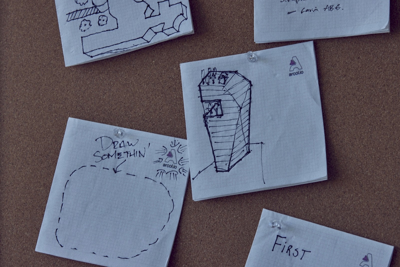
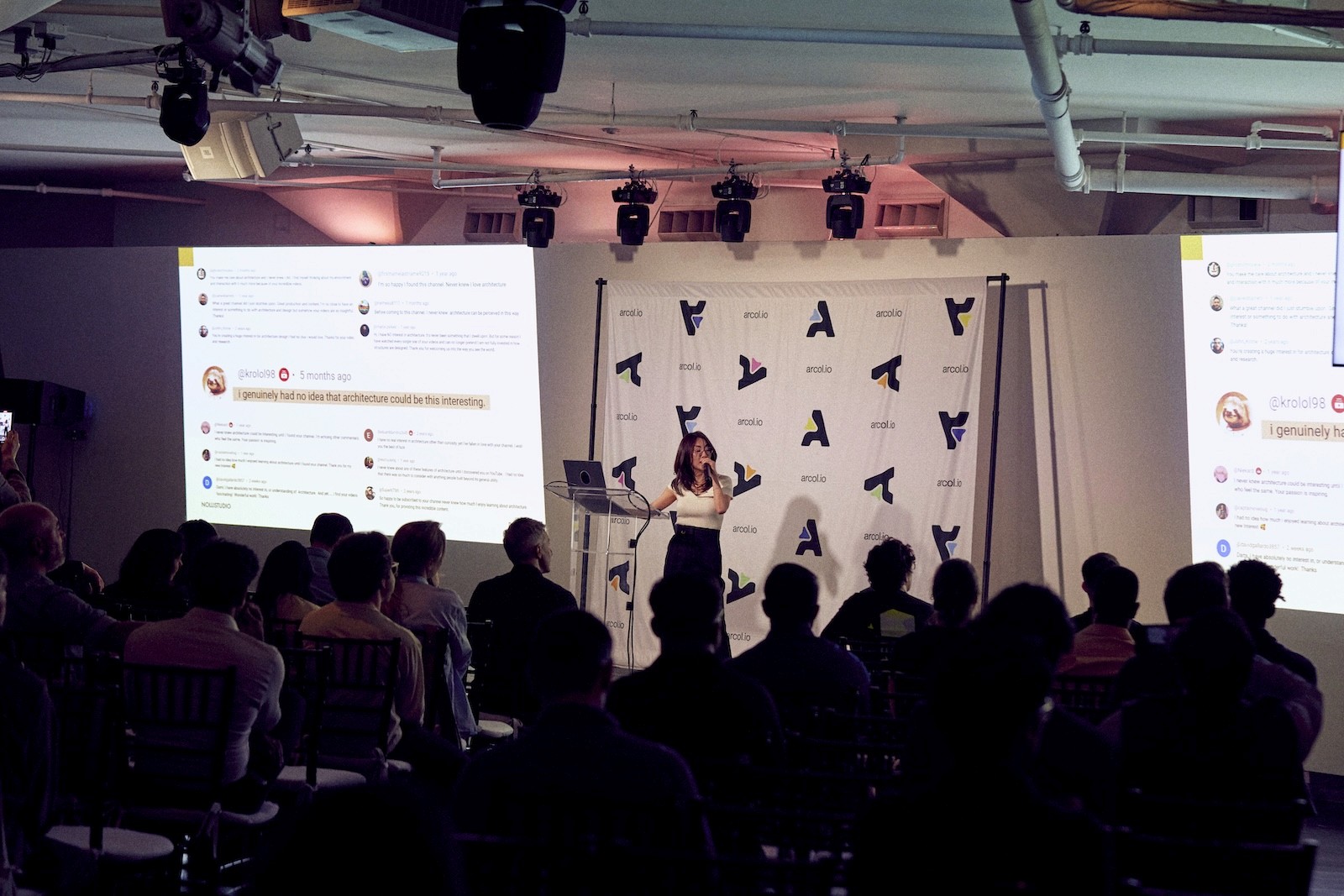
Launch day came faster than expected. After a whirlwind of bug fixes and final touches, we headed to the venue for Retooling AEC. Inside, the space buzzed. A swag table. Napkin sketch pinboards. String lights and soft couches. A strong lineup of speakers and panelists presenting big ideas in a cozy venue.
Onstage, Gavin Crump shared a BIM-credibly punny take on how existing architectural tools are failing us, followed by Mercedes Carriquiry with a beautiful lily pad analogy about problems with common roots. Dami Lee, an architect turned content creator, followed up by sharing her framework: balancing the technical with the emotional. Tools, code, and design systems matter, but so do wonder, intention, and cultural context. Great works - be it videos, buildings, or software - need both.
At the end of the day, we left the venue with our bodies exhausted, but our brains and hearts full. On the ride back to the hotel, my colleagues and I discussed everything from our favorite video games and our former colleagues’ whereabouts, to how each passing building could be recreated in Arcol. As the conversation lulled, I noticed the reflections of the city lights on the car windows, a testament to a living city built by humans.

You may have heard that “a poor craftsman blames their tools.” It’s a common idiom implying that craft lies in the person, rather than the tool. But there is still some craft in the tool yet, as a quick chat with any mechanical keyboard or fountain pen enthusiast will reveal. There’s a kind of intimacy with the tools used by professionals day in and day out, every minor frustration or spark of joy multiplied over months or years.
Over time, our tools shape us. Frustration turns to jadedness, and joy becomes empowerment. But it’s easy to forget that tools, like buildings, are also built by humans.
It reminded me why this launch felt different. It wasn’t just about shipping as much as we could as fast as we could. It was community: jamming with colleagues, incorporating feedback, and listening to users. It was trusting a gut instinct, or finding excitement, joy, and delight in the creative process. And sometimes, it was having to make difficult decisions, together. By holding space for the emotional aspect of software in addition to the technical, we hope to build tools that architects love to use.
Click here to get started with a trial of Arcol!